Creating Layouts in CSS
What are CSS layouts?
CSS Layouts are an essential part of modern web design that plays a critical role in creating visually appealing and functional web pages. You can think of a layout as a blueprint for your website, which defines the structure and appearance of your web pages. It defines where your navigation bar should be placed, how your content should be organized, if you have a sidebar, and so on.
Float and clear in CSS
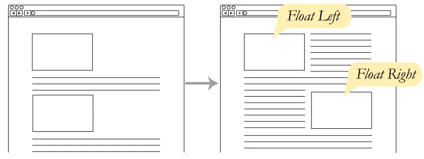
As you can see in the image above (image source), floats are a basic tool in web design that allows you to position an element to the left or right of its container. For example, you can use floats to position an image to the left of a paragraph of text. The code (HTML and CSS) for an image floated to the left of a paragraph would look something like this:
Responsive design in CSS
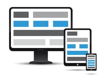
Creating websites and sizing your content to fit the window in your browser is all very nice. But what happens when you open your website on a mobile device? Or on a tablet? Or on a desktop computer? The content will be too small to read, or it will be too big and will overflow the screen. The content will be all over the place or be too small to read. This is where responsive design comes in.
Introduction to Flexbox
")
Flexbox is a powerful layout tool in CSS that allows you to create complex layouts and align elements in various ways. With Flexbox, you can control the positioning, size, and order of elements. It is super useful to create complex layouts. For example, you can use Flexbox to create a responsive navbar, a responsive footer, a responsive grid, and more.
Introduction to CSS Grid
Well done! Now that we understand how Flexbox works, we can move on to the next layout system, which is called CSS Grid. In contrast with Flexbox (which is one-dimensional), CSS Grid is a two-dimensional layout system that allows us to create complex layouts with rows and columns. It is very powerful, and it is supported by all modern browsers.