
Well done! Now that we understand how Flexbox works, we can move on to the next layout system, which is called CSS Grid. In contrast with Flexbox (which is one-dimensional), CSS Grid is a two-dimensional layout system that allows us to create complex layouts with rows and columns. It is very powerful, and it is supported by all modern browsers.
What makes CSS Grid different#
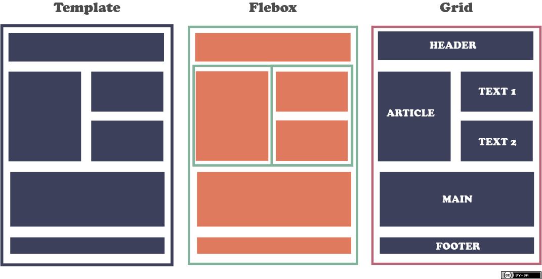
CSS Grid is a new layout system that changes the way we think about web design. Previously, with Flexbox, we had to think about our layout in terms flexible containers. We would put containers inside containers, and we would use the flex properties to align the elements inside them. However, this approach is not very intuitive.
With CSS Grid, we can think about our layout in a more structured way, because we can define the number of rows and columns that we want to have directly in our CSS code. We can also define the width and height of each row and column (in absolute or relative units), and we can align the elements inside them.
For example, a container with 4 columns and 3 rows:
.container {
  display: grid;
  grid-template-columns: 1fr 1fr 1fr 1fr;
  grid-template-rows: 1fr 1fr 1fr;
}
In the code above, we have created a grid container with 4 columns and 3 rows. We have then set the width of each column to 1fr, which means that each column will take up the same amount of space. We have also set the height of each row to 1fr, which means that each row will take up the same amount of space.
How CSS Grid works#
Remember how in Flexbox we had a parent container and child elements? Well, CSS Grid works in a similar way. We have a parent container, which is called the grid container, and we have child elements, which are called grid items. The grid container is the element that we apply the display: grid property to, and the grid items are the elements that are direct children of the grid container.
Let’s see an example:
<style>
  .grid-container {
    display: grid;
  }

  .grid-item {
    background-color: #eee;
    padding: 1rem;
  }

  .grid-item-1 {
    background-color: #f00;
  }

  /* ... */

  .grid-item-6 {
    background-color: #0f0;
  }
</style>

<div class="grid-container">
  <div class="grid-item grid-item-1">1</div>
  <div class="grid-item grid-item-2">2</div>
  <div class="grid-item grid-item-3">3</div>
  <div class="grid-item grid-item-4">4</div>
  <div class="grid-item grid-item-5">5</div>
  <div class="grid-item grid-item-6">6</div>
</div>
In this code, we have created a grid container with the display: grid property. We have then created six grid items with the grid-item class. We have also created six grid-item- classes to give each grid item a different background color.
Now imagine that you want to organize your layout in a grid with 3 columns and 2 rows. You can do this by setting the grid-template-columns and grid-template-rows properties on the grid container. Here’s the code:
.grid-container {
  display: grid;
  grid-template-columns: 1fr 1fr 1fr;
  grid-template-rows: 1fr 1fr;
}
That was easy! But how do we know which grid item goes where? Well, we can use the grid-column and grid-row properties to specify the position of each grid item. Here’s the code:
.grid-item-1 {
  grid-column: 1 / 2;
  grid-row: 1 / 2;
}

.grid-item-2 {
  grid-column: 2 / 3;
  grid-row: 1 / 2;
}

.grid-item-3 {
  grid-column: 3 / 4;
  grid-row: 1 / 2;
}

.grid-item-4 {
  grid-column: 1 / 2;
  grid-row: 2 / 3;
}

.grid-item-5 {
  grid-column: 2 / 3;
  grid-row: 2 / 3;
}

.grid-item-6 {
  grid-column: 3 / 4;
  grid-row: 2 / 3;
}
In this code, we have set the grid-column property to 1 / 2 for the first grid item, which means that it will start at column 1 and end at column 2. We have also set the grid-row property to 1 / 2 for the first grid item, which means that it will start at row 1 and end at row 2. We have then done the same for the other grid items.
Grid lines#
In the previous example, we have used the grid-column and grid-row properties to specify the position of each grid item. However, we can also use the grid-column-start, grid-column-end, grid-row-start, and grid-row-end properties to specify the position of each grid item. Here’s the code:
.grid-item-1 {
  grid-column-start: 1;
  grid-column-end: 2;
  grid-row-start: 1;
  grid-row-end: 2;
}

.grid-item-2 {
  grid-column-start: 2;
  grid-column-end: 3;
  grid-row-start: 1;
  grid-row-end: 2;
}

.grid-item-3 {
  grid-column-start: 3;
  grid-column-end: 4;
  grid-row-start: 1;
  grid-row-end: 2;
}

.grid-item-4 {
  grid-column-start: 1;
  grid-column-end: 2;
  grid-row-start: 2;
  grid-row-end: 3;
}

.grid-item-5 {
  grid-column-start: 2;
  grid-column-end: 3;
  grid-row-start: 2;
  grid-row-end: 3;
}

.grid-item-6 {
  grid-column-start: 3;
  grid-column-end: 4;
  grid-row-start: 2;
  grid-row-end: 3;
}
The code above is equivalent to the code from the previous example. However, it is more verbose and harder to read. That’s why we usually use the grid-column and grid-row properties instead of the grid-column-start, grid-column-end, grid-row-start, and grid-row-end properties. But it’s good to know that they exist!
Grid areas#
In the previous example, we have used the grid-column and grid-row properties to specify the position of each grid item. However, we can also use the grid-area property to specify the position of each grid item. Here’s the code:
.grid-item-1 {
  grid-area: 1 / 1 / 2 / 2;
}

.grid-item-2 {
  grid-area: 1 / 2 / 2 / 3;
}

.grid-item-3 {
  grid-area: 1 / 3 / 2 / 4;
}

.grid-item-4 {
  grid-area: 2 / 1 / 3 / 2;
}

.grid-item-5 {
  grid-area: 2 / 2 / 3 / 3;
}

.grid-item-6 {
  grid-area: 2 / 3 / 3 / 4;
}
The code above is also equivalent to the code from the previous example! You have several approaches to specify the position of each grid item. However, just remember that the grid-column and grid-row properties are the most common ones.
Grid gaps#
Alright, so now you have design your layout in a grid with 3 columns and 2 rows. But what if you want to add some space between the grid items? Well, you can do this by setting the grid-column-gap and grid-row-gap properties on the grid container. Here’s the code:
.grid-container {
  display: grid;
  grid-template-columns: 1fr 1fr 1fr;
  grid-template-rows: 1fr 1fr;
  grid-column-gap: 10px;
  grid-row-gap: 15px;
}
The code generates something like this:

That was easy! But what if you want to add some space between the grid items and the grid container? Well, you can do this by setting the grid-gap property on the grid container. Here’s the code:
.grid-container {
  display: grid;
  grid-template-columns: 1fr 1fr 1fr;
  grid-template-rows: 1fr 1fr;
  grid-gap: 10px;
}
Using media queries#
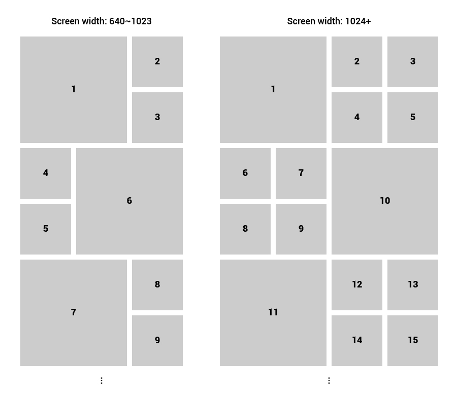
Media queries come in handy when you are using CSS Grid. For example, you can use media queries to change the number of columns in your grid depending on the screen size. In the image above, you can see that the layout changes depending on the screen size. CSS Grid makes it easy to do this by adding a few media queries and defining the number of columns for each screen size.
.grid-container {
  display: grid;
  grid-template-columns: 1fr 1fr 1fr;
  grid-template-rows: 1fr 1fr;

  @media (max-width: 768px) {
    grid-template-columns: 1fr 1fr;
  }

  @media (max-width: 480px) {
    grid-template-columns: 1fr;
  }
}
In this code, we have set the number of columns to 3 when the screen size is greater than 768px. We have then set the number of columns to 2 when the screen size is greater than 480px. And finally, we have set the number of columns to 1 when the screen size is less than 480px.
Some youtube tutorials#
A guide by Kevin Powell#
A guide by Traversy Media#
Conclusion#
CSS Grid is a powerful tool that allows you to create complex layouts with ease. It is supported by all major browsers and it is easy to learn. Do notice that this article is just an introduction to CSS Grid. There are many more things that you can do with it. So, if you want to learn more about CSS Grid, I recommend you to check out the following in depth guide by CSS Tricks: