
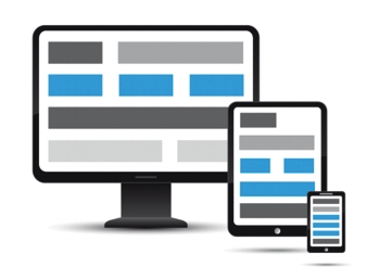
Creating websites and sizing your content to fit the window in your browser is all very nice. But what happens when you open your website on a mobile device? Or on a tablet? Or on a desktop computer? The content will be too small to read, or it will be too big and will overflow the screen. The content will be all over the place or be too small to read. This is where responsive design comes in.
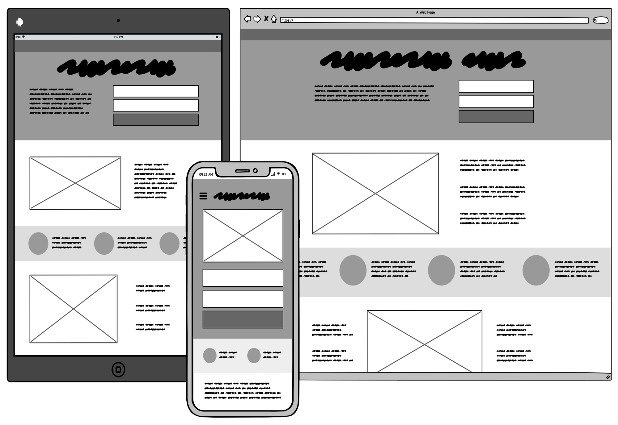
Responsive design is a design technique that allows web pages to adapt to different screen sizes and device types. Try resizing this window and see how the content changes. Depending on the current platform where I hosted this course, maybe you’ll see a sidebar appear or disappear, or maybe you’ll see the content rearrange itself to fit the screen. This is responsive design in action.
The same way, if you open this website on a mobile device, you’ll see that the content is rearranged to fit the screen. This is also responsive design in action.
Responsive design is an essential aspect of modern web design that allows web pages to adapt to different screen sizes and device types. With responsive design, you can ensure that your web pages look great on any device, whether it’s a desktop, tablet, or mobile phone. In this article, we’ll explore how to create responsive designs in CSS.
Media Queries#
Media queries are the foundation of responsive design in CSS. When they were first introduced, media queries were a revolution because they allowed web developers to target different screen sizes and device types with CSS. For example, you could could make the heading font size larger on mobile devices and smaller on desktop computers.Or you could create a web page with a sidebar that only appears on larger screens and disappears on smaller screens.
In short, they work by applying different styles to a web page depending on the screen size and device type. Here’s an example of a media query:
@media (min-width: 768px) {
  /* Styles go here */
}
In this code, we have created a media query that applies styles to a web page when the screen size is 768 pixels or more. Whatever styles we add inside the media query will only apply to screens with a min-width of 768px.
Mobile-First Design#
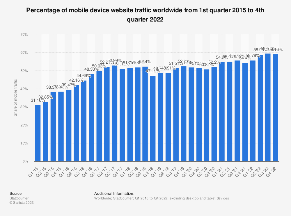
Mobile traffic represents more than half of all web traffic, and it has been growing steadily over the past few years. This means that it is more important than ever to design websites with mobile devices in mind.
With such a large number of people using mobile devices to access the web, it is important to design websites that work well on mobile devices. This is where mobile-first design comes in.
Mobile-first design is a design technique that involves designing for mobile devices first and then adapting the design for larger screen sizes. This technique ensures that the web page is optimized for mobile devices and then enhanced for larger screen sizes.
Even if you don’t design the mobile version of your website first, it is a great idea to create your design while having the mobile version in mind. This will ensure that your web page looks great on mobile devices and that you make the right design decisions. But how do you do this?
How to code for mobile devices first#
So you are a web developer and your web designer has given you a design for a web page. You open the design in your browser and it looks great. But there does not seem to be a mobile version of the design. What do you do?
Actually, that is not a big problem (to be fair, this is what usually happens if you are building a website for a small client). You can easily make sure that your web page looks great on mobile devices by using a mobile-first development approach. Here’s how to do it:
From general to specific#
When writing your CSS, start by writing the styles that apply for every screen size and device type, such as the font size, font family, and color. This will ensure that your web page looks great on all devices.
Assume a mobile user#
Write the styles that only exist on smaller screen sizes and device types. For example, if you have a hamburger meny on your web page, you can write the styles for the hamburger menu assuming that it will always be present. Then, you can use a media query to hide the hamburger menu on larger screen sizes and device types.
Build up from small to large#
Continue this way building from the smallest screen size to the largest screen size. This will ensure that your web page looks great on all devices.
Here is an example of how to use mobile-first design to create a responsive layout:
/* Styles for mobile devices */
.container {
  display: flex;
  flex-direction: column;
}

/* Styles for larger screen sizes */
@media (min-width: 768px) {
  .container {
    flex-direction: row;
  }
}
In this code, we have used a media query to apply styles for larger screen sizes. We have set the flex-direction property to row to change the layout of the .container element from a vertical layout to a horizontal layout.
Did you notice that we used min-width in the media query? This is because we want the styles to apply to screen sizes that are 768px or larger. If we used max-width, the styles would apply to screen sizes that are 768px or smaller. But remember that we are using mobile-first design, so we want our base styles (those outside of the media query) to apply to mobile devices and then enhance the design for larger screen sizes.
Adding breakpoints#
So now you know how to create a media query and how to use mobile-first design. You now have your mobile-first design and you want to add a breakpoint for larger screen sizes. Say. you want to add some styles to make layout display two columns on tablets and three columns on desktop computers.
But which width should you use for your media query? When do you start considering that a screen is a tablet or a desktop computer?
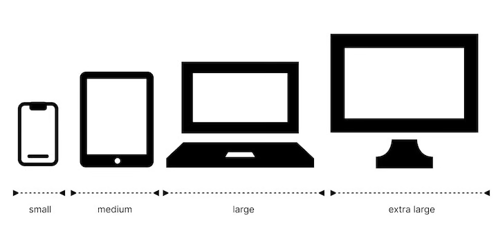
This is where breakpoints come in. Breakpoints are the widths at which you want to add a media query. There is no universal standard for breakpoints, but there are some common breakpoints that you can use. I, myself, usually use the following breakpoints (which are the ones that Bootstrap uses):
| Breakpoint | Screen Size Range |
|---|---|
| Extra Small (XS) | < 576px |
| Small (SM) | >= 576px |
| Medium (MD) | >= 768px |
| Large (LG) | >= 992px |
| Extra Large (XL) | >= 1200px |
| Extra Extra Large (XXL) | >= 1400px |
Keep in mind that you do not need to use all of these breakpoints or make specific design decisions for all of them. In fact, I would suggest that you use as few breakpoints as possible. This will make your code easier to maintain and your design more consistent.
Here is a longer example of a page with media queries:
<!DOCTYPE html>
<html>
<head>
  <title>Responsive Design Example</title>
  <style>
    /* Default styles for all screen sizes */
    .container {
      width: 100%;
      max-width: 1200px;
      margin: 0 auto;
      padding: 0 20px;
    }
    .box {
      width: 100%;
      height: 200px;
      background-color: red;
      margin-bottom: 20px;
    }

    /* Styles for small screen sizes */
    @media (min-width: 576px) {
      .box {
        width: 50%;
        margin-right: 20px;
        margin-bottom: 0;
        float: left;
      }
    }

    /* Styles for medium screen sizes */
    @media (min-width: 768px) {
      .box {
        width: 33.33%;
      }
    }

    /* Styles for large screen sizes */
    @media (min-width: 992px) {
      .box {
        width: 25%;
      }
    }
  </style>
</head>
<body>
  <div class="container">
    <div class="box"></div>
    <div class="box"></div>
    <div class="box"></div>
    <div class="box"></div>
  </div>
</body>
</html>
Fluid Layouts#
Alright, now we understand how to use media queries and mobile-first design. So now it is time to tell you this: try to use media queries as little as possible.
Why? Because they can be very difficult to maintain. If you have a media query that applies to a certain screen size, you will have to update your code for a specific screen size every time you want to make a change. This can be very difficult to maintain!
Sometimes you will have to use media queries, but most of the time, you can use fluid layouts instead.
Fluid layouts are layouts that adjust their width and height depending on the screen size. Fluid layouts are useful for ensuring that a web page looks great on any screen size and device type.
Here’s an example of a fluid layout:
<!DOCTYPE html>
<html>
<head>
  <title>Fluid Design Example</title>
  <style>
    .container {
      width: 100%;
      max-width: 1200px;
      margin: 0 auto;
    }
    .box {
      width: 100%;
      height: 200px;
      background-color: red;
      margin-bottom: 20px;
    }

    /* Fluid layout styles */
    @media (min-width: 768px) {
      .container {
        width: 90%;
      }
      .box {
        width: 45%;
        margin-right: 5%;
        margin-bottom: 0;
        float: left;
      }
    }

    @media (min-width: 1200px) {
      .box {
        width: 30%;
      }
    }
  </style>
</head>
<body>
  <div class="container">
    <div class="box"></div>
    <div class="box"></div>
    <div class="box"></div>
    <div class="box"></div>
  </div>
</body>
</html>
In this code, we have used a media query to apply styles for larger screen sizes. We have set the width of the .container element to 90% to make the layout fluid. We have also set the width of the .box elements to 45% to make them fluid as well. Note that we have not used any media queries for smaller screen sizes. This is because the default styles for the .container and .box elements are already fluid.
So always try to use properties that adapt to the screen size instead of using media queries. This is an art and takes practice, but after a few tutorials and projects, you will get the hang of it.
Here is a nice video by Kevin Powell that explains responsive design in more detail.
We will delve more in depth into fluid layouts in the next tutorials, but for now, you can use the code above to create fluid layouts.
Conclusion#
In conclusion, responsive design is an essential aspect of modern web design that allows web pages to adapt to different screen sizes and device types. With media queries, mobile-first design, and fluid layouts, you can create web pages that look great on any device, whether it’s a desktop, tablet, or mobile phone. By practicing these techniques and experimenting with different layouts, you can take your web design skills to the next level and create stunning web pages that are flexible, adaptable, and responsive to different devices and screen sizes.